The Salty Woodsman
HAPPY THINGS FOR SALTY PEOPLE
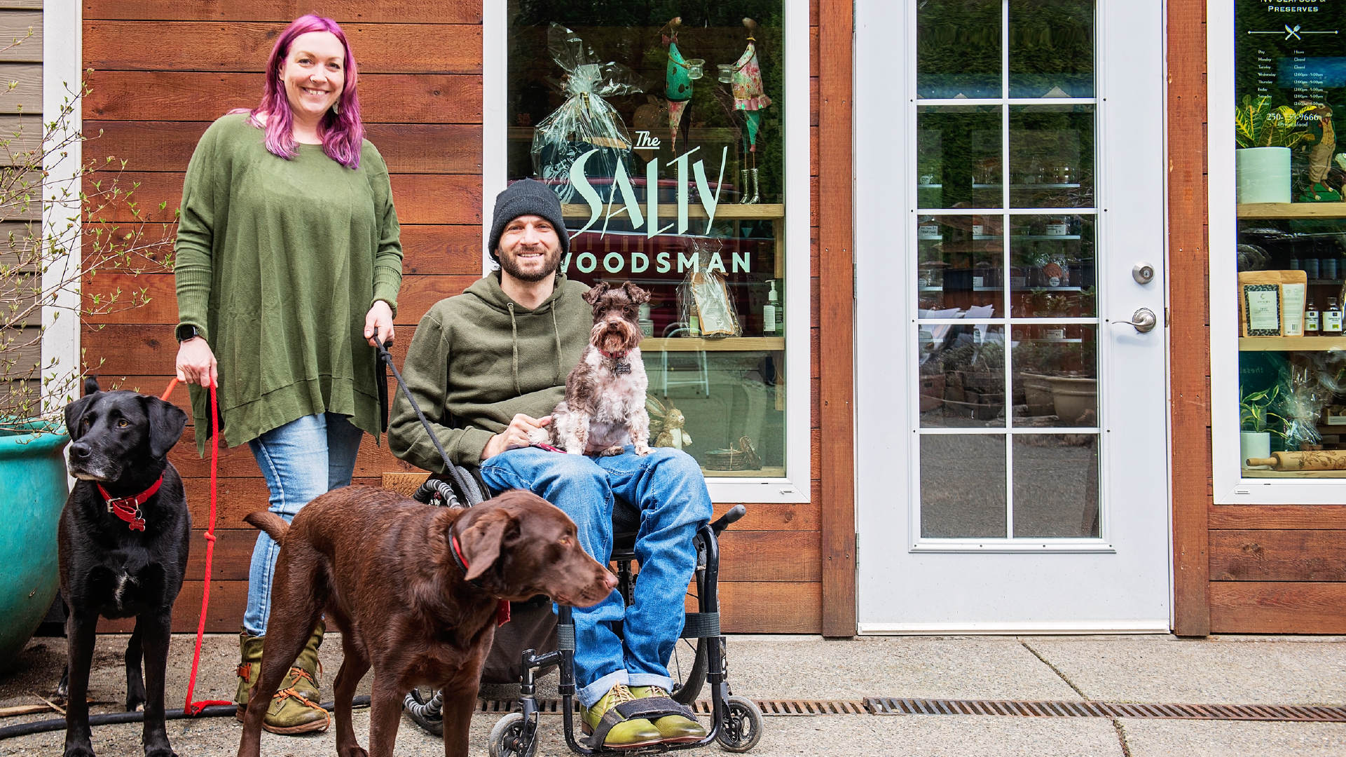
Nile & Nadine’s forest shop is so much more than a seafood store. It’s a space for community, a shopping destination full of heart, and yes, they sell seafood alongside beautiful goods for the home and pantry. Their brand identity needed to do their story justice. It needed to prick the curiosity of travelers, and entice tourists to pay a visit and leave with armloads full of happy things time and time again.
THE CHALLENGE
Being tucked away in the forest is idyllic, but not exactly ideal for attracting new and repeat business. And that’s exactly what Nile & Nadine needed to do. To become a must-stop destination for people en-route to the west coast and a cherished spot for locals in the know. To do this, first and foremost, we needed to make it very clear who they were, what they sold and where they were located. Then bring it to vibrant life with a brand identity that was fun, quirky and a little bit wild.
HOW WE DID IT
Quirky Does It
Main Logo
Monogram

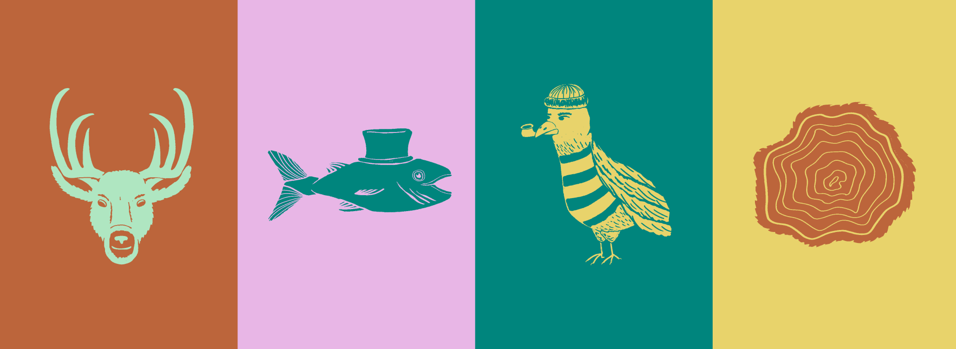
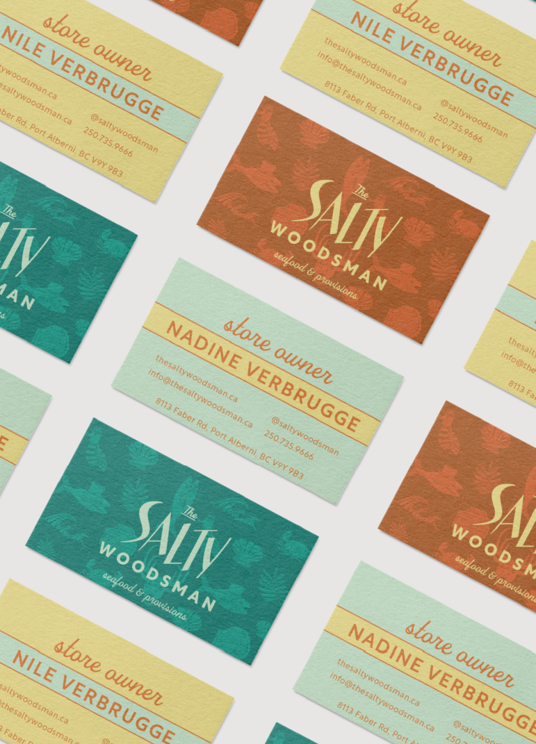
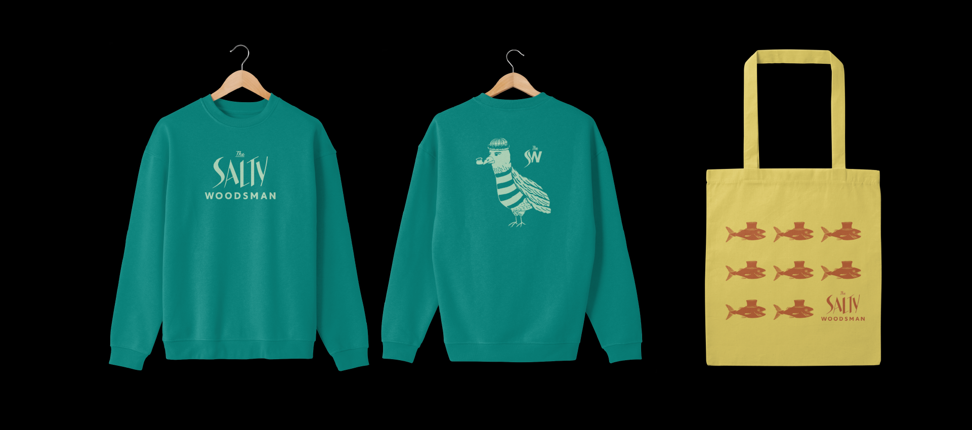
Inspired by lake houses, palm springs motels, and gloriously tacky wallpapers, the Salty brand came to life with typography influenced by the jagged fish bones, and one-of-a-kind illustrations (picture pipe smoking seagulls and fish in top hats). With each illustration we highlighted the variety of products they sell, while injecting a major hit of personality. Slightly off-beat, the illustrations, combined with loud clashing colours created a brand identity that is tongue-in-cheek and completely irresistible.
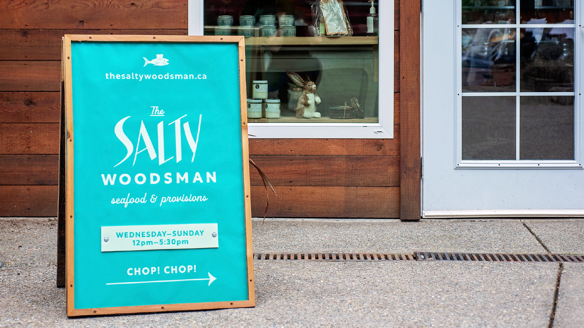


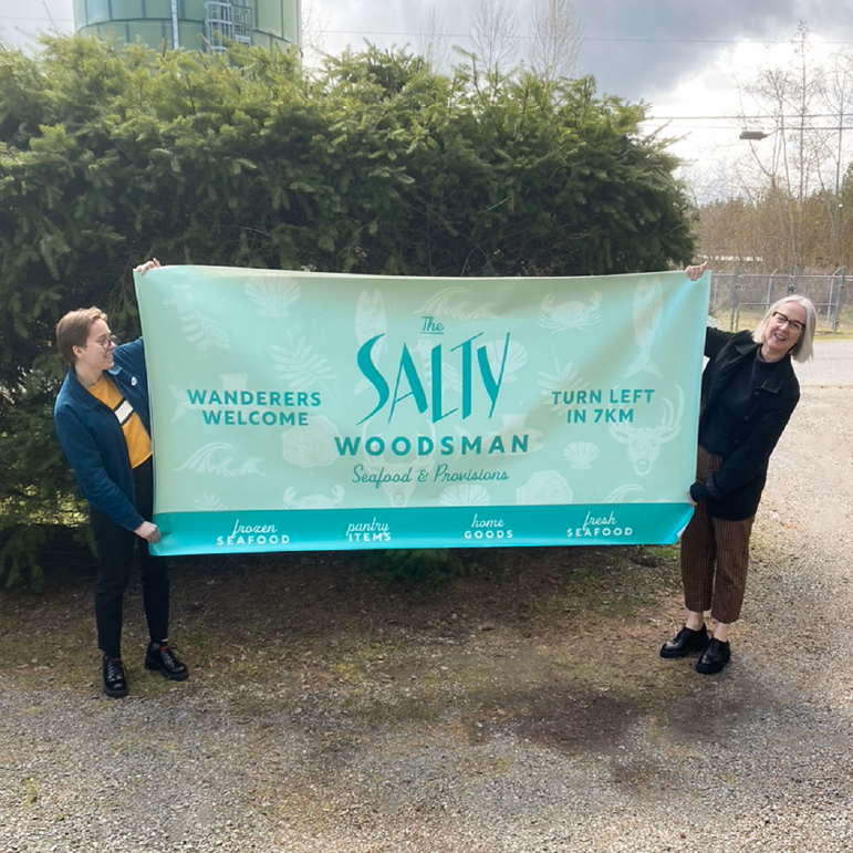
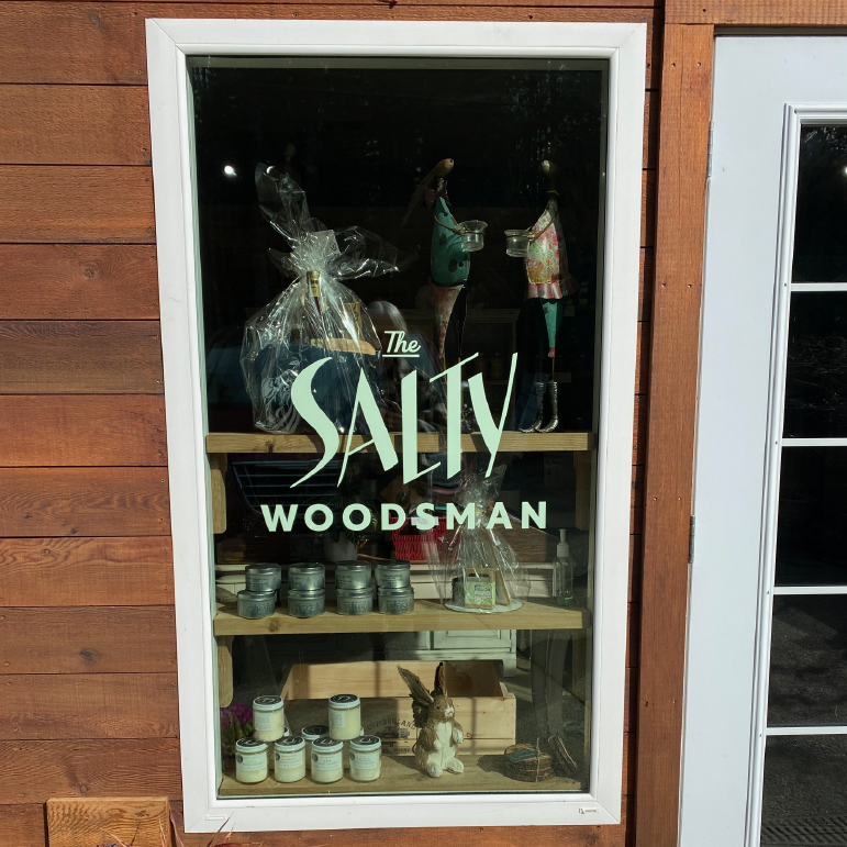
SIGNAGE
WEB DESIGN
The Salty Woodsman website had a big job to do. It needed to capture the essence of their forest location, showcase their eclectic offering while remaining user-friendly, enticing customers to shop online and in-store. We needed to craft the right language and visuals to create a suitably salty vibe that felt genuine and compelling. By being consistent and creative with their brand messaging and images, the end result is a charming sense of place and people. A perfect example of words and visuals working beautifully (and strategically!) together.
MERCH
SOCIAL MEDIA
Social Media plays a huge role in the Salty Woodsman marketing plan, as it should. It enables them to connect with their audience in a strategic way that somehow feels intimate and personal. Planning is our love language. To that end, we created a series of social media templates to organize their content and roll it out for best results, while providing the language and visual guides to keep every post feeling authentically salty.

TESTIMONIAL
Happy Things for Salty People
“We learned a lot about branding, our customers and ourselves through their process.” Clever Jane managed to capture the intangible spirit of our business: the name, the branding, and the website look and feel 100% us! Our new brand identity is not only wonderfully-wild to look at, it shares our story with an honest and clear voice. The Clever Jane team was a joy to work with, approachable, curious, and the best part, we had loads of fun!
Nile & Nadine — The Salty Woodsman
a clever jane and majorette collaboration
A SPECIAL THANKS TO
NILE & NADINE — @saltywoodsman
PHOTOGRAPHY — @danikasea
CLEVER JANE — art direction, strategy, identity design, web design/development, merch, signage
Liz Parsons, Emily Kiana, Barry Begus
MAJORETTE — naming, strategy, brand messaging, content & copy writing
Marget Milne & Elizabeth Hewitt
