Lavender Studio
ECO-FRIENDLY SALON
Jennifer Peake is a hair stylist that has been working in the industry for more than 20 years. In 2021 her dream of opening her own studio came to life in her hometown Qualicum Beach. Shortly after meeting Jen, we knew we’d found a kindred spirit. She sought to work with eco-friendly products that are kind to people and the planet and was drawn to all things beautiful. Jen wanted to create a gorgeous space for her employees and clients, one that was in sync with her new brand identity.
THE CHALLENGE
Jen drew inspiration from many things when she designed her salon interiors. With an abundance of colours, textures and geometric shapes to guide us, the challenge was to channel it all into a visual brand that would compliment the space and do justice to Jen’s creative spirit.
HOW WE DID IT
Grounded by Art
Main Logo
Monogram
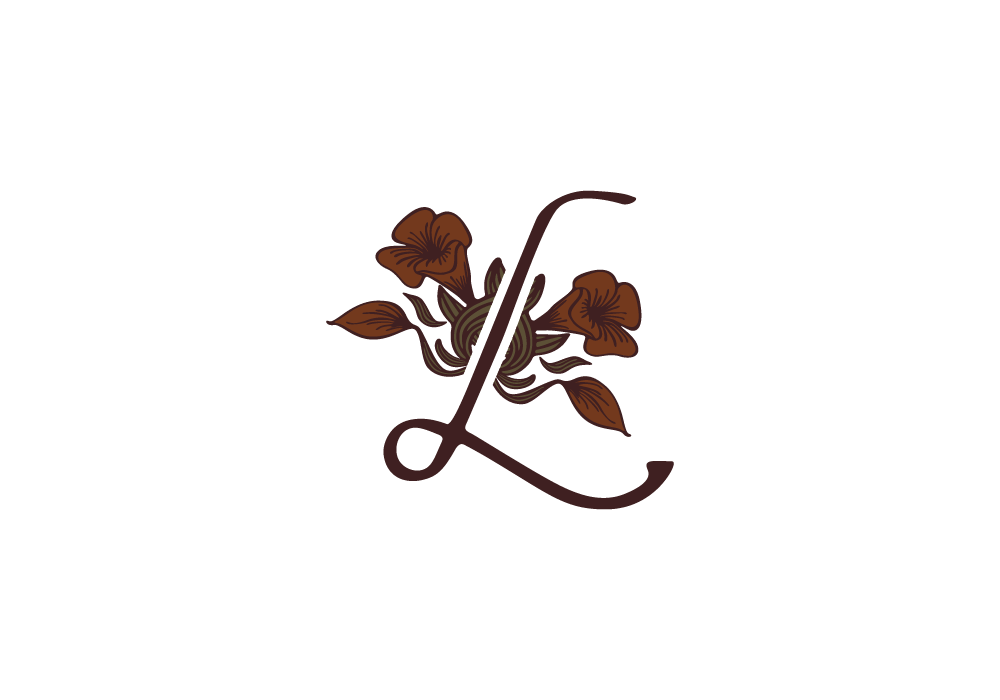
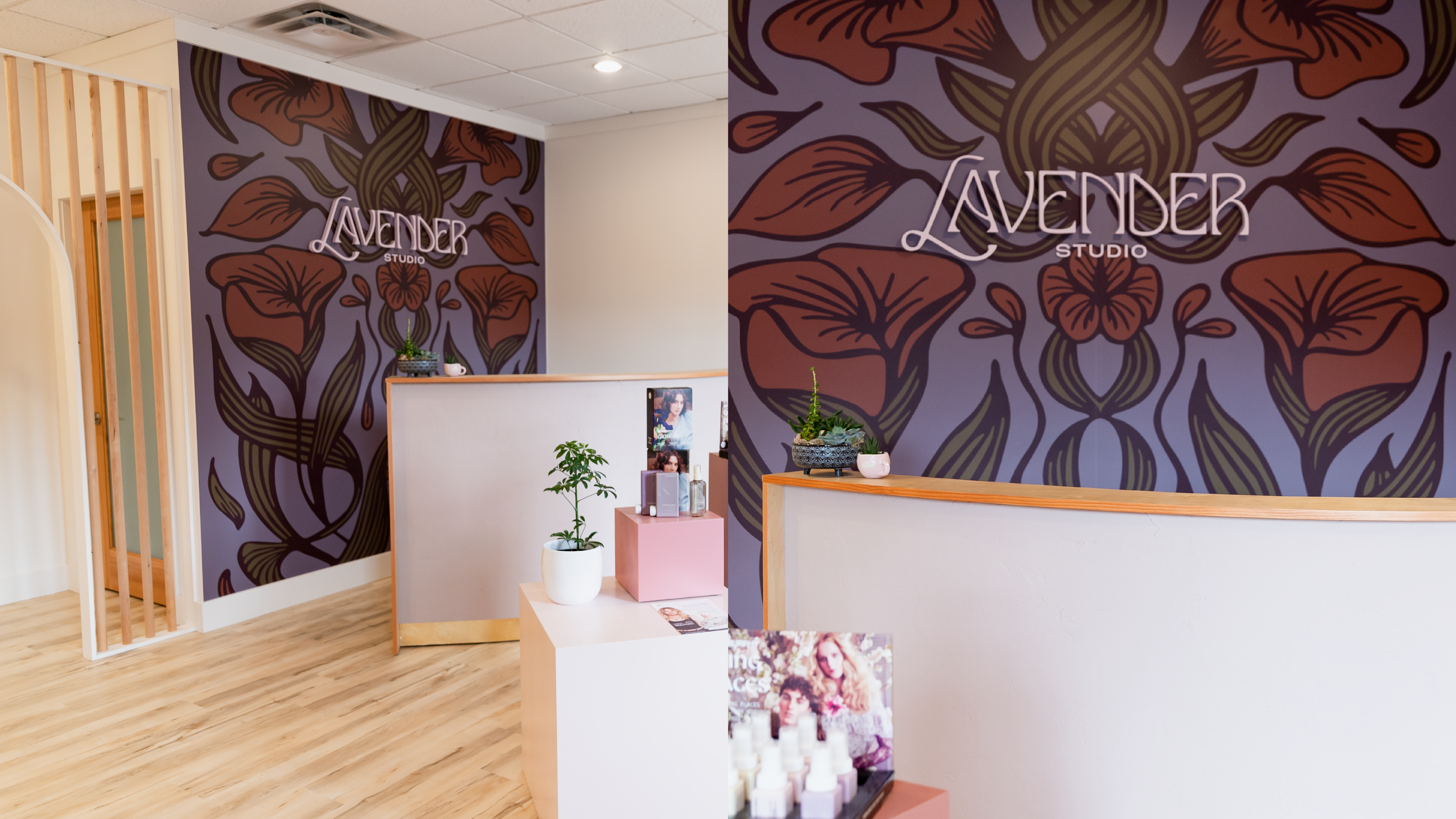
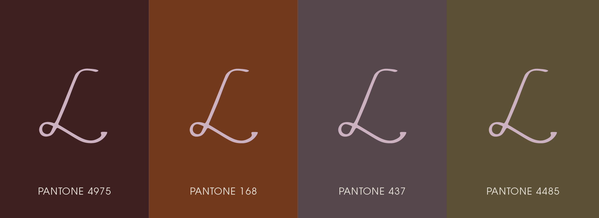
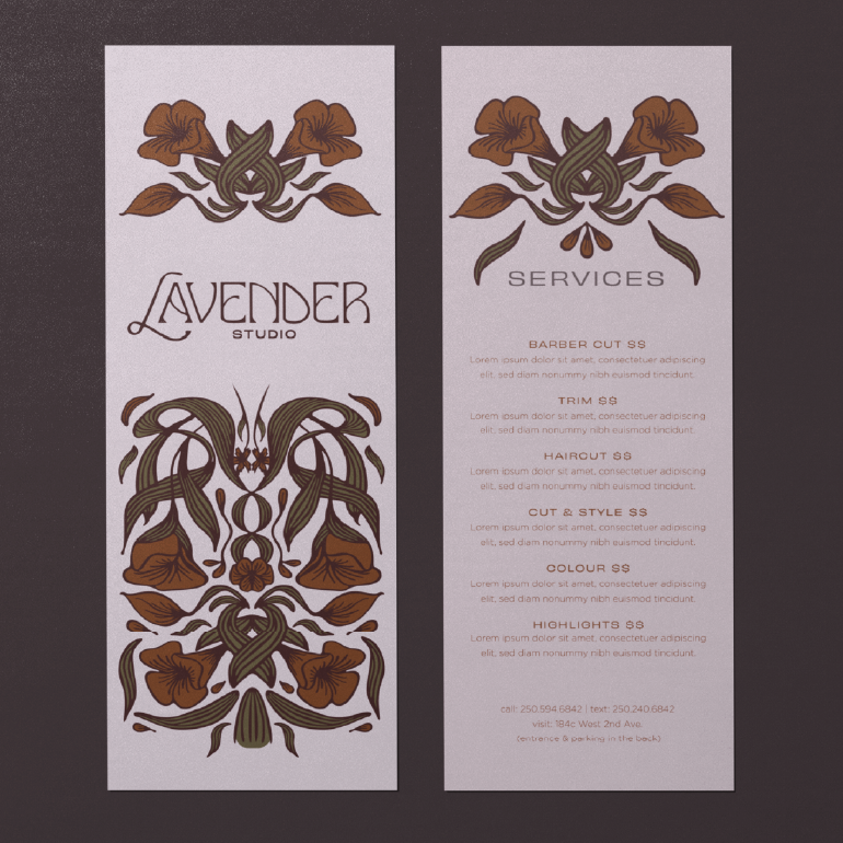
Jen was drawn to all things Art Nouveau. With this in mind we created a symmetrical custom floral mural illustration, anchoring the space with something she found both inspiring and beautiful. Lavender’s visual identity continued to take shape with fluid, floral designs that mimicked the feeling of hair, while contrasting with the static lines of the studio itself. From the outset, Jen was opposed to using lavender flowers in her branding. It felt too obvious to her, and to us. Colour was our conduit. We opted to hint back to lavender by using various shades of purple, gradually layering them to something richer and darker. From there we added a hint of olive, and a caramel accent to match the salon chairs.

APPLICATION
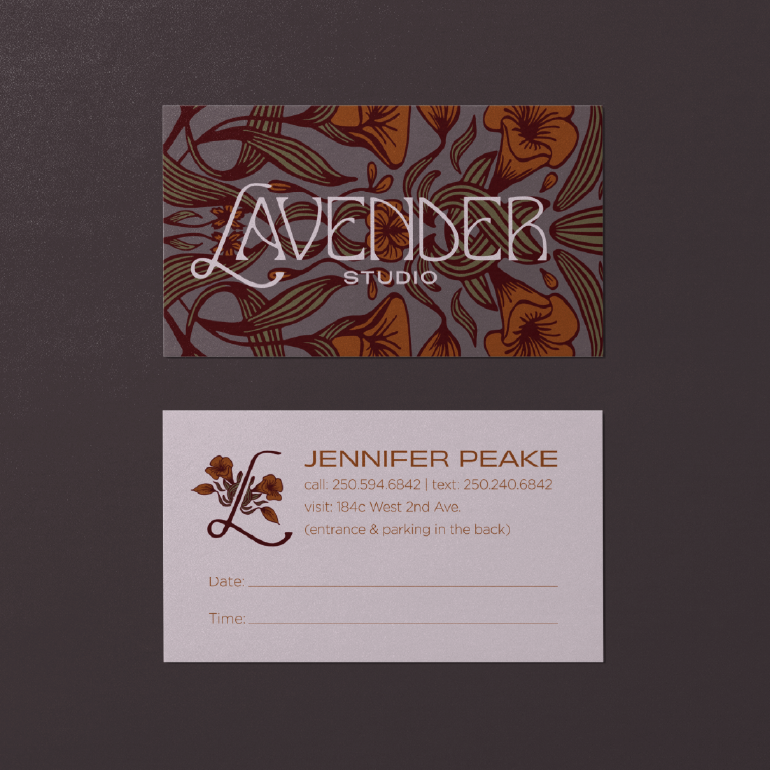
Lavender’s branding began with the traditional Art Nouveau logotype. Tall and narrow, it inspired the mural, and helped to anchor the space beautifully. In contrast, OhNo’s Obviously typeface felt perfectly modern, wide and fresh, while still echoing the Art Nouveau style.
We worked alongside Earl at Scott Signs to bring our vision for a printed mural to radiant life. The name needed to pop! We layered raised letter cutouts of the wordmark over the illustrated background to make sure it stood out, bold and beautiful. The lavender colour needed to be just right, and Earl made sure we nailed it.
a clever jane production
A SPECIAL THANKS TO
JENNIFER PEAKE — @lavenderstudio.qb
CLEVER JANE — art direction, strategy, identity design, signage, mural illustration
Liz Parsons, Emily Kiana, Barry Begus
