Rusted Rake Brewing Rebrand
FROM FARM TO TAP
When our longtime clients at Rusted Rake reached out to us for a new brand identity and website, we were thrilled to assist. Originally a much-loved farm to table eatery in Nanoose Bay, they were in the process of radically changing their business model, which meant a change in brand identity. With their highly anticipated, family-run, farm to tap brewery, eatery and event space quickly nearing the launch date, Rusted Rake Brewing was ready to face the world with a fresh look for this new chapter in their story.
THE CHALLENGE
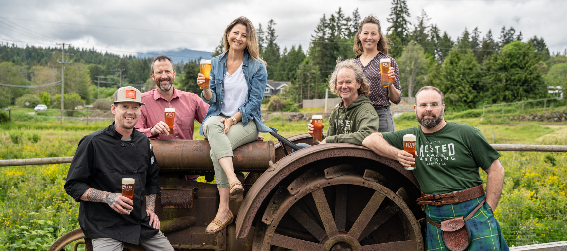
There’s a lot of heart at the Rake. From the people who run it, to the people who love it, we wanted to incorporate that sense of joy and community into their branding. It needed to be fun, and whimsical, while still referencing a working farm, and the creatures great and small who call it home. Their transformation from an eatery to a brewery needed to be reflected in their new brand.
HOW WE DID IT
With Playful Hearts
Before
After

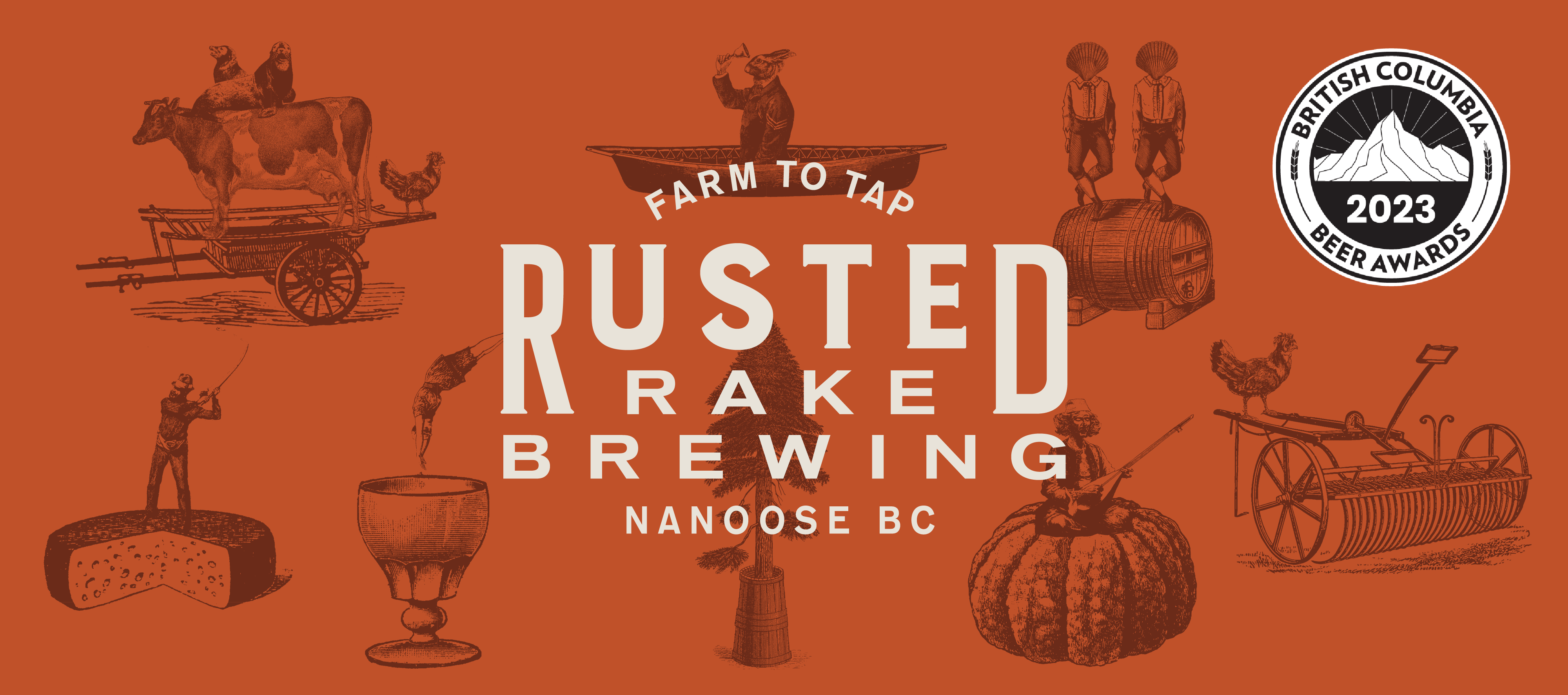
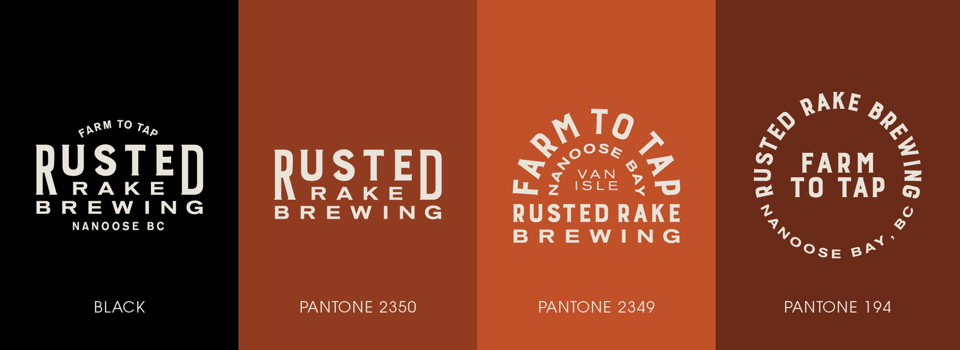
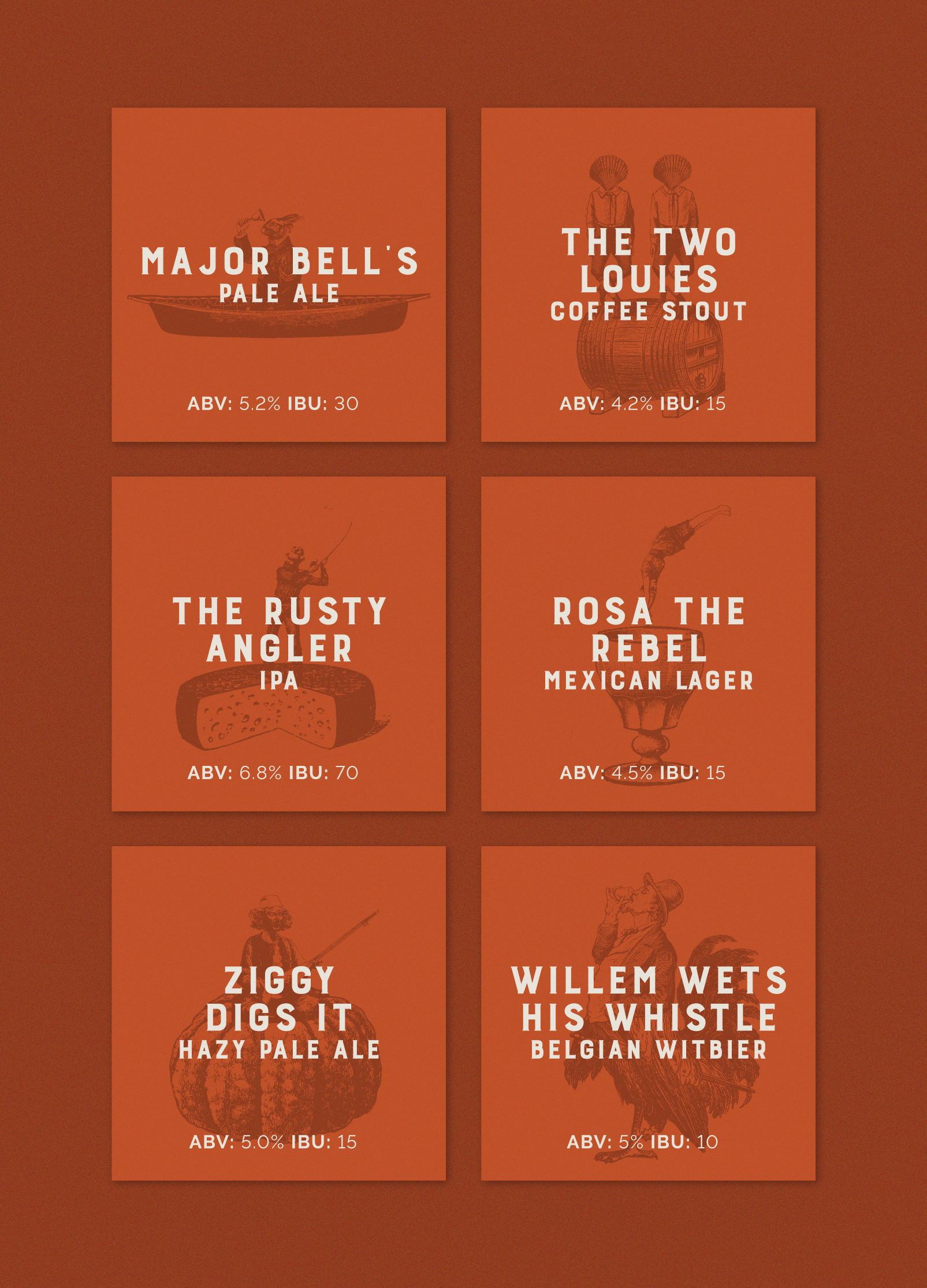
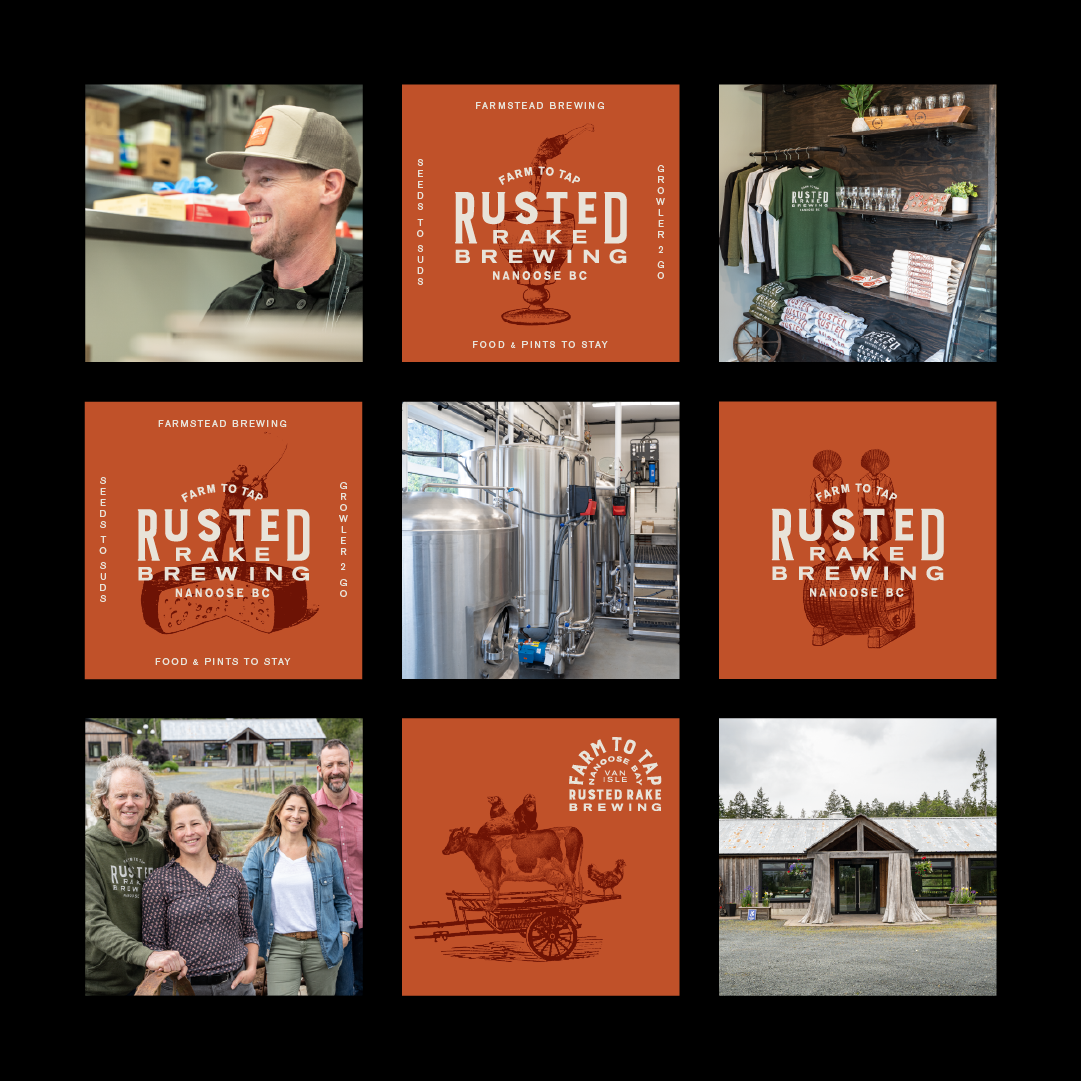
Some projects have so much potential, it’s hard to know where to begin and which way to go. We needed to focus on what set them apart, their unique setting. Inspired by the property’s vintage farm equipment, we opted to incorporate these visuals into their new identity. This led us to a colour palette of rusty gold, muted red, black and cream. We created a curious cast of woodblock characters to be used throughout their branding- rabbits in rafts, and dancing cockleshell men that somehow feel right at home at the Rake. These playful visuals and the attached messaging added a layer of whimsy to the brand that is both charming and original. We also designed a simple logo wordmark that referenced the long-standing traditions of breweries past, present, and future.
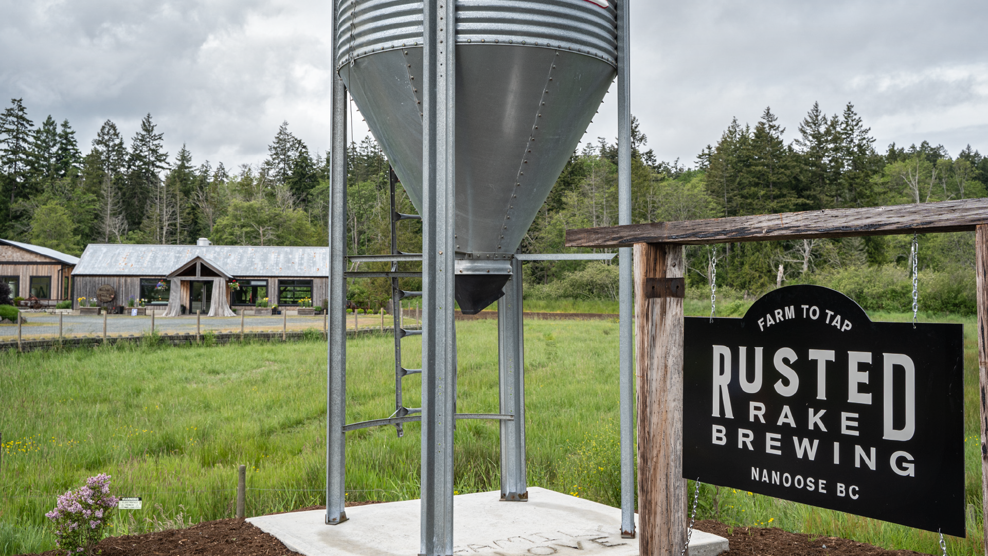

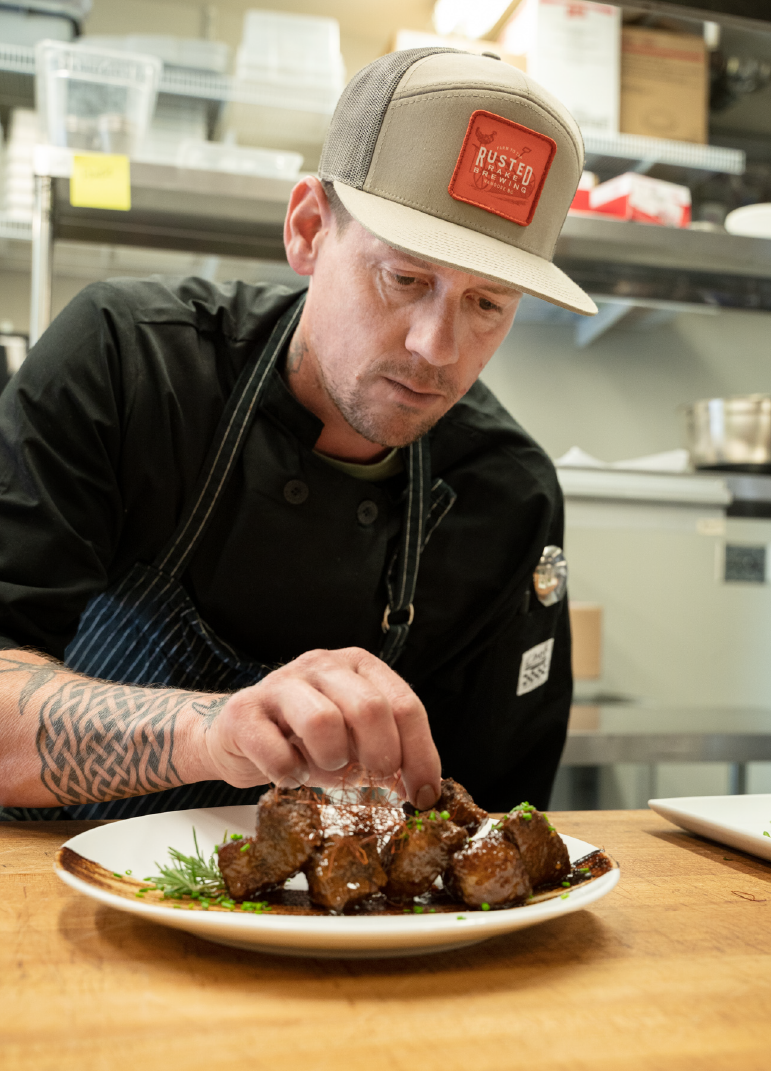
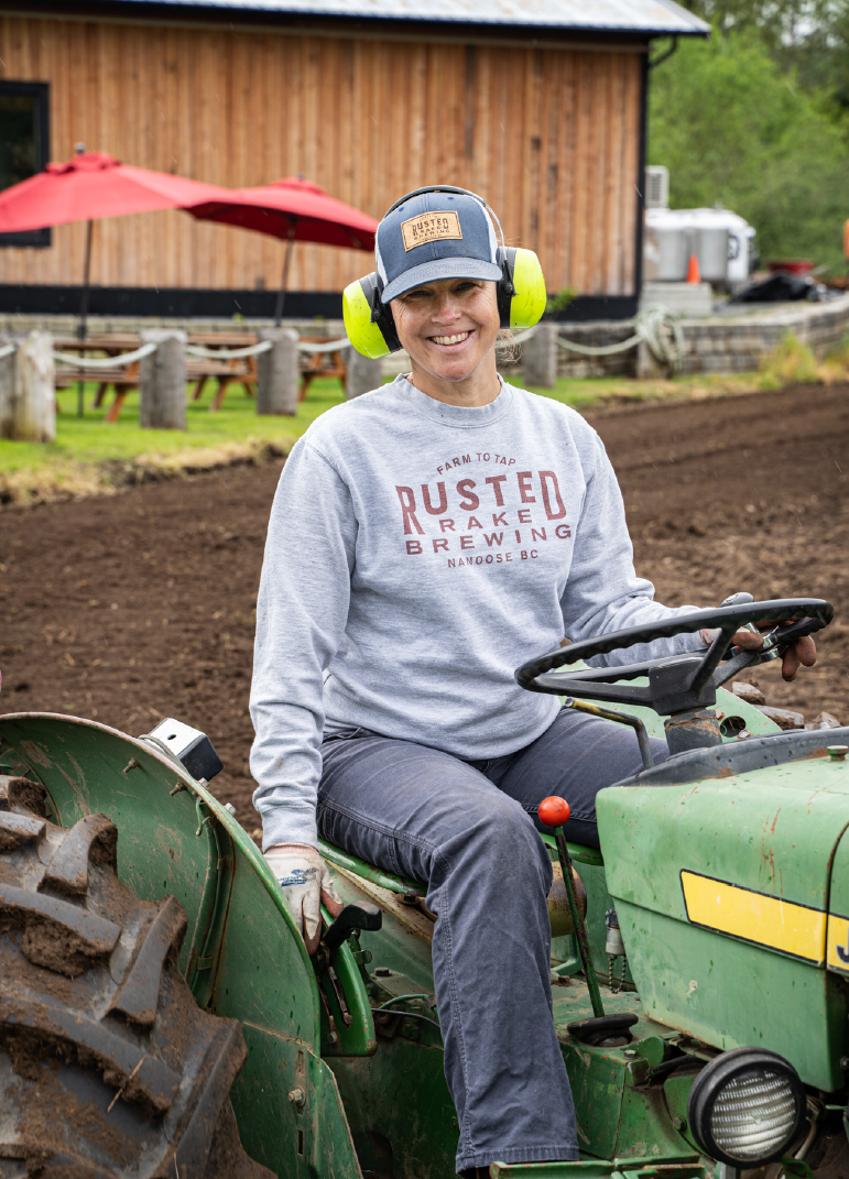
APPLICATION
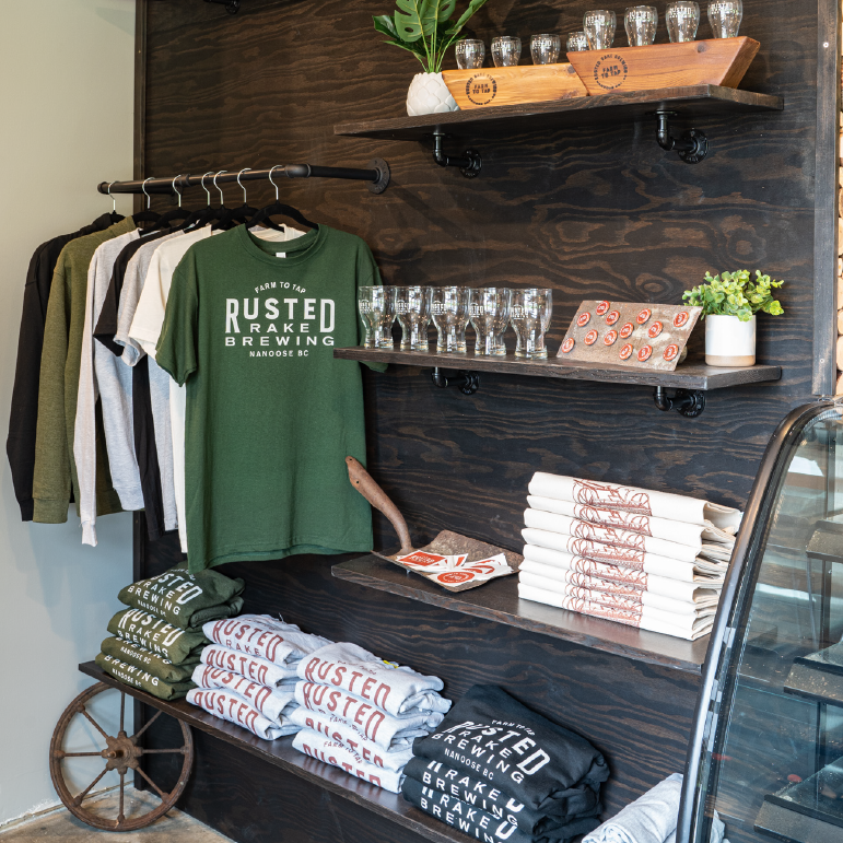
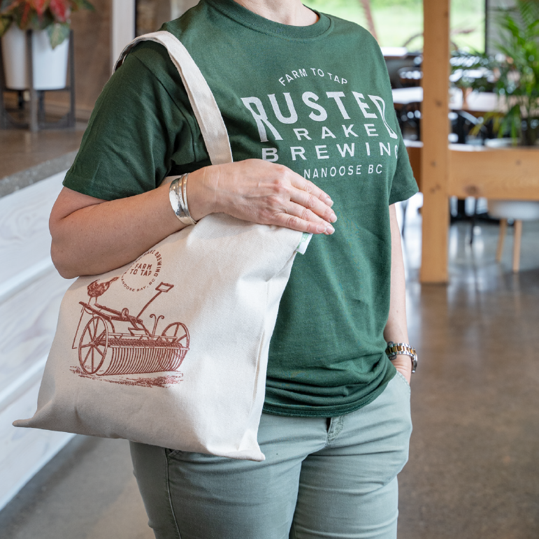
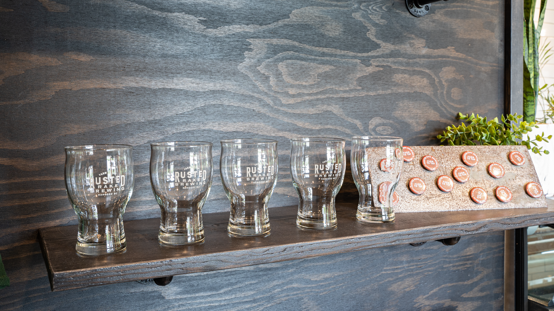
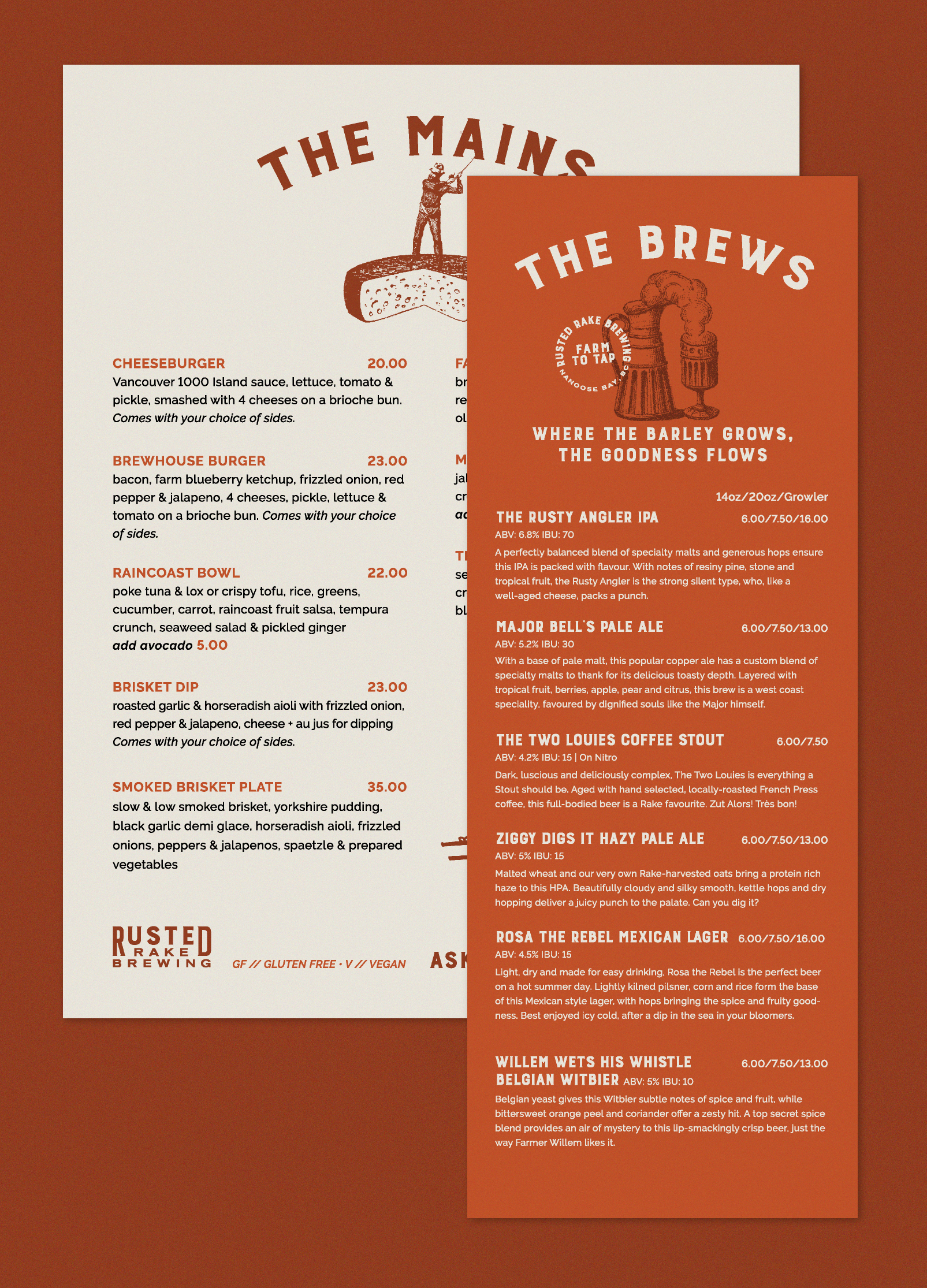
When you love something, you want to tell the world. We designed a complete line of Merch for the fine people at the Rake to offer for sale including: T-shirts, Hoodies, Sweatshirts, buttons, stickers and magnets. This merch won “Best Merchandise” at the BC Beer Creative Industry Awards in 2022. We also designed a menu and fun character flight cards for each of their beers.
WEB DESIGN
We wanted locals, and travelers to know that the Rusted Rake was open and ready for business. Their website needed to provide clarity on who they were, what they stood for and exactly where they were located. It also needed to showcase a family business that could appeal to retirees, young families, millennials and everyone in-between. We built a custom website, structured to grow alongside their business, while telling the story of a charming little farm, a brewery and the lovely people behind it. This design won best website at the BC Beer Creative Industry Awards in 2022.
SOCIAL MEDIA TEMPLATES
TESTIMONIAL
“One word…ECSTATIC!”
Receiving our branding served to energize and inspire us as we prepared to launch. As a new business and brewery, we needed a brand identity that would help us stand out in BC’s crowded brewery marketplace. To say Clever Jane exceeded our expectations is an understatement. They took our brief and created a brand that is whimsical, meaningful and aspirational. Their discovery process was thoughtful and thought-provoking. They encouraged us to reflect and respond with honesty, which helped us hone in on our priorities for our business and its future. Meetings were brief but productive, opinions were shared but we never felt pressured, and the entire process moved along at a good pace. Working with Clever Jane was a pleasure from start to finish, our new identity gives people an immediate sense of who we are, and what we stand for. Our branding is flexible and playful, and with so many unexpected elements, there’s a lot of fun to be had.
Craig — Rusted Rake Brewing
a clever jane and majorette collaboration
A SPECIAL THANKS TO
THE RUSTED RAKE FAMILY — @rustedrakebrewing
PHOTOGRAPHY — @rainerplendl
CLEVER JANE — identity design, web design/development, merch, signage
Liz Parsons, Emily Kiana, Barry Begus
MAJORETTE — brand messaging, branded beer names, content & copy writing
Marget Milne & Elizabeth Hewitt.
