Swag Print Factory
WE MAKE THINGS
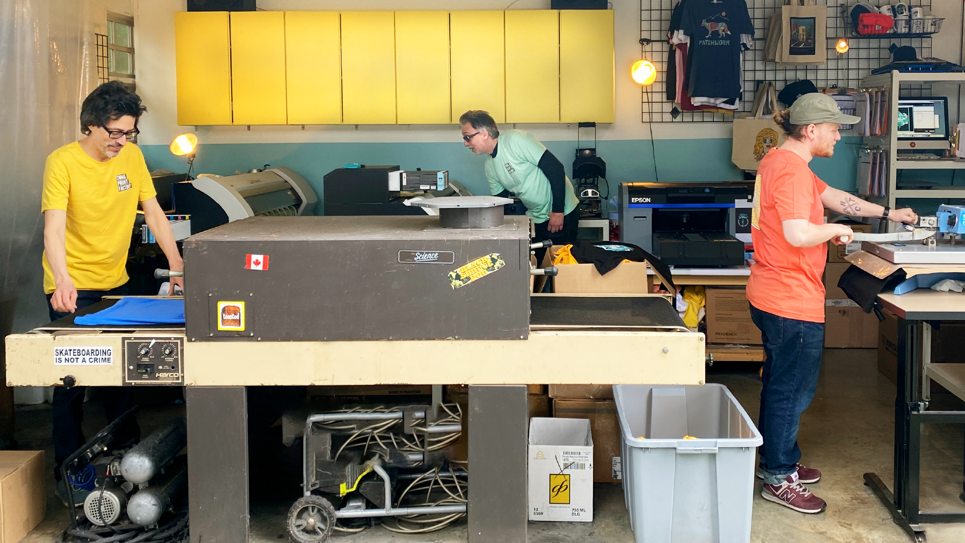
Swag had been in business for more than 25 years, making fair-wage, responsible merch for countless businesses, organizations and people. Initially, custom printing was offered as an offshoot to its sister company, Swag Design Factory, however as happy clients talked and word spread the demand for printed merch soared. It was clear that Swag’s print component deserved its own digital space to call home.
From the outset, we knew the brand identity needed to convey three things;
- Our commitment to treading gently through the printing process, to minimize our footprint, and work alongside like-minded folks;
- Swag’s depth of experience, printing all kinds of things for more than three decades;
- Lastly, we wanted to keep it light and playful, print is fun!
THE CHALLENGE
We needed to create a unique brand identity system for use on a custom e-commerce website that was user friendly, while being completely transparent about the nature of the industry. The printing world is far from perfect. We wanted to be honest about this while still taking pride in how we do things differently, the planet-friendly processes we prioritize and the people we choose to work with. We also wanted to convey a sense of fun. Merch is a cause for celebration and the brand needed to capture those good-time vibes.
HOW WE DID IT
Real Stories Bring Real Results!
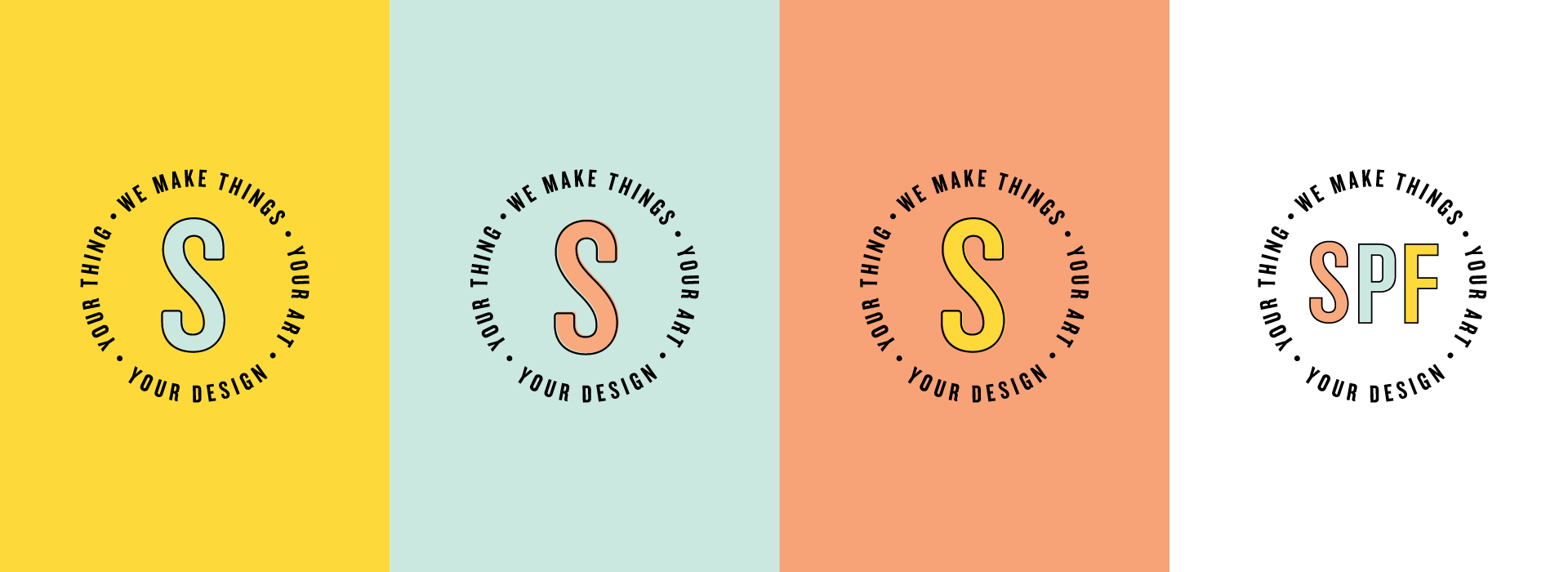
Main Logo
Monogram
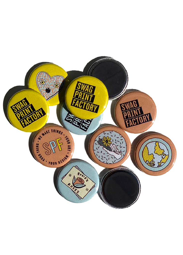
Inspired by old factory stacks and the repeating linear movement of our printing machines, we created an abstract logo mark that is entirely unique. By animating the mark, we referenced the literal work of the printing machine in bringing a client’s design to inky life.
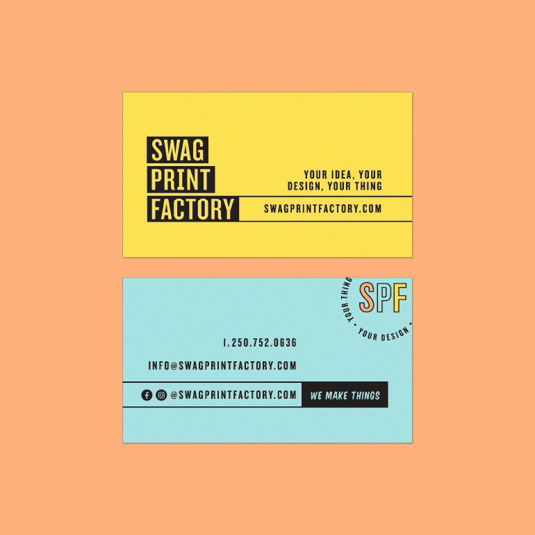
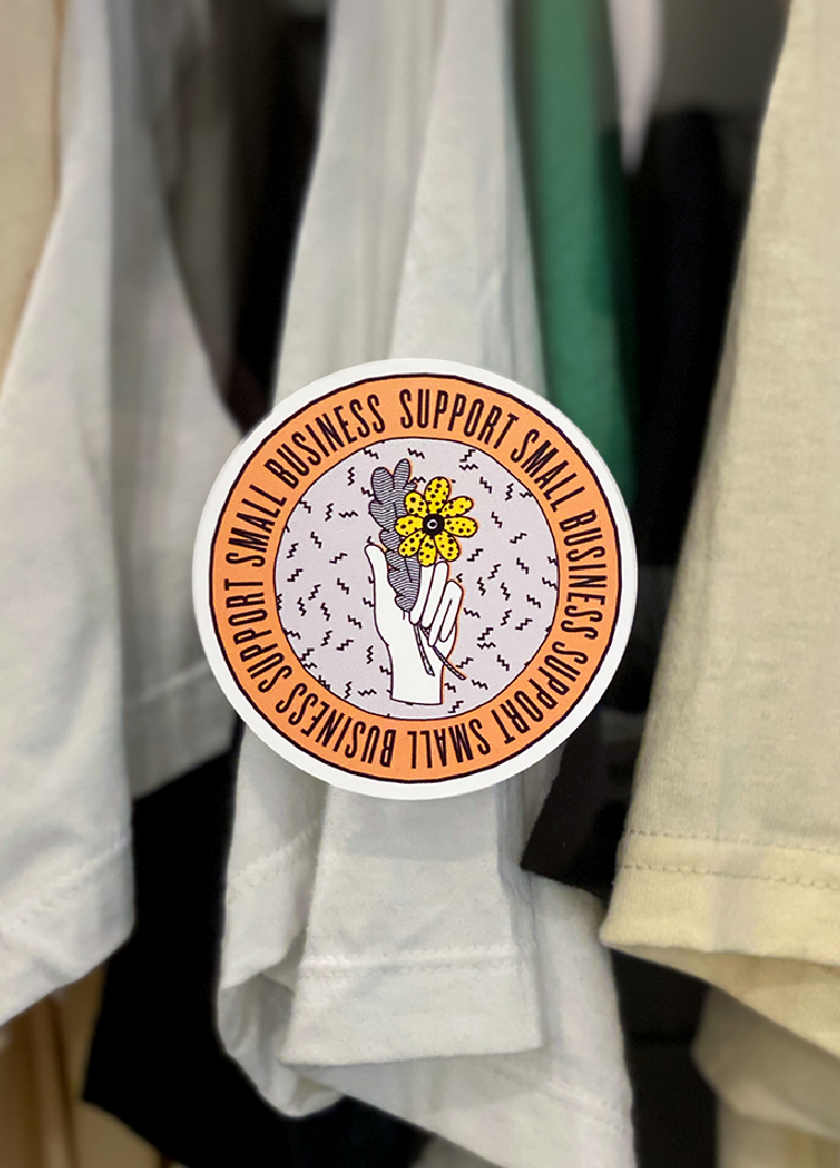
We built a custom e-commerce platform to make it easy for clients to learn about the products, discover our way of working, and order online. We collaborated with illustrator @silkyhendesign to create a series of unique drawings to reference the wide variety of things we make. From the get-go, illustrations rather than photographs felt like the right visual direction for Swag, they’re bespoke after all, just like the work we do. To compliment the identity system, we used a brushstroke font called Komika Title and Knockout featherweight from Holfer & Co, and paired this with a fresh, playful colour palette. Lastly we crafted fresh language that was honest and conversational. We wanted customers to feel connected and invested in the Swag story from the moment they landed on the site.


APPLICATION
WEB DESIGN
Functional & Transparent
We built a custom e-commerce website from the ground up that focused on the client experience. Designed for customers to see what’s available, how much it costs, and easily place their order, with Swag’s phone number prominently featured throughout, because sometimes we all need to talk to a human. People should feel good about their purchase, we used the website to showcase Swag’s MO- no hidden fees, no deceptive practices, just honest, fair-wage, natural fibre merch printed using people-friendly inks. The final site is a beautiful example of intentional design- functional, original and easy for both clients and administrators to navigate.
MAJOR RESULTS
Since the site launched, business has exploded with revenue up 100% in the first year alone!
a clever jane and majorette collaboration
A SPECIAL THANKS TO
SWAG PRINT FACTORY — @swagprintfactory
ILLUSTRATION — @silkyhendesign
CLEVER JANE — art direction, strategy, identity design, web design/development
Liz Parsons, Barry Begus, Kate Carruthers, Emily Kiana
MAJORETTE — brand messaging, web copy
Elizabeth Hewitt
