Rosco Emmit Rebrand
MADE BY HAND IN QUALICUM BEACH
Rosco Emmit, lovingly named for her boys’ middle names, Kerry’s handcrafted soaps, candles, scents and salts were finding their way into more and more stores. Her small-batch Qualicum Beach operation was growing, and fast. Growth is always an opportunity for transformation, and it was time for the brand to bloom alongside her business.
THE CHALLENGE
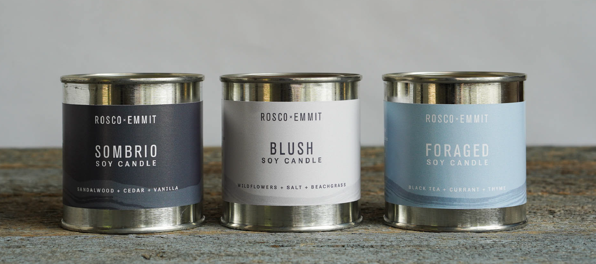
Kerry wanted Rosco Emmit to be memorable in a competitive market. She sought to upscale her product labels and bring a west coast feminine energy to her branding. It needed to be adaptable, and translate across a wide variety of products of varying sizes. The challenge was to create something distinctively beautiful, while being understated enough to work in all kinds of settings.
HOW WE DID IT
Simply Beautiful
Before
After
There’s power in subtlety. While Rosco Emmit’s original logo was already striking, we encouraged Kerry to introduce colour to reflect the stones, winter skies and misty seascapes she’s inspired by. Sometimes the softest touch is the most effective and just a hint of colour brought a coastal energy to the brand in the gentlest of ways.
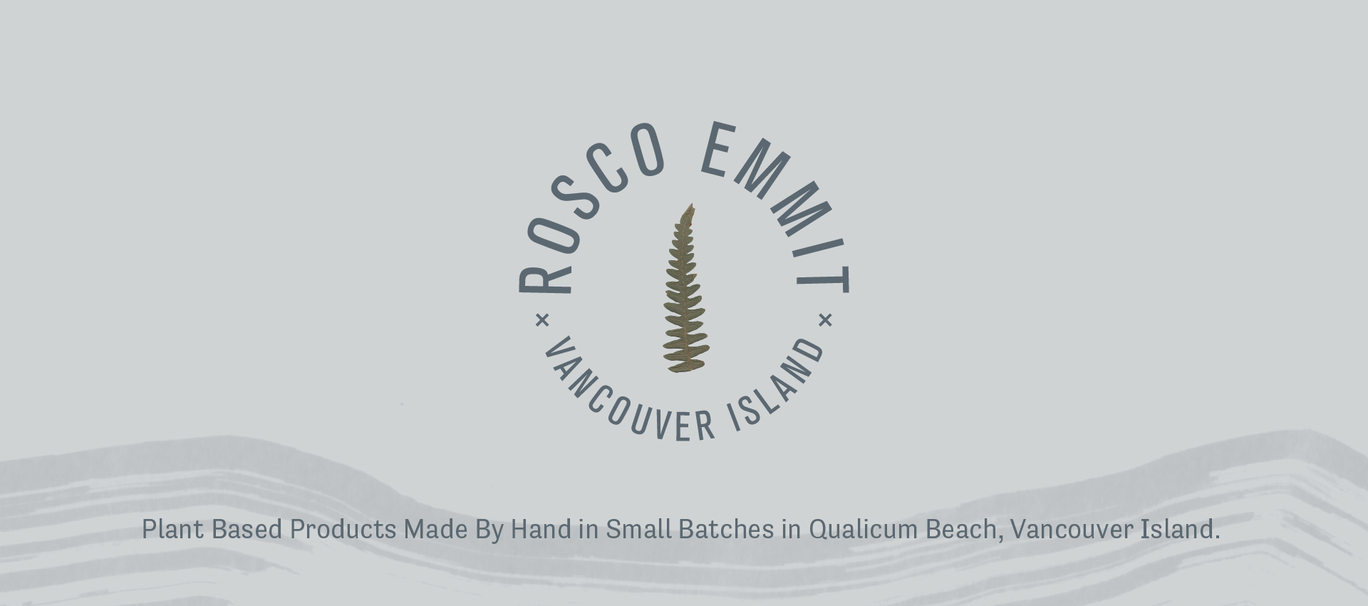
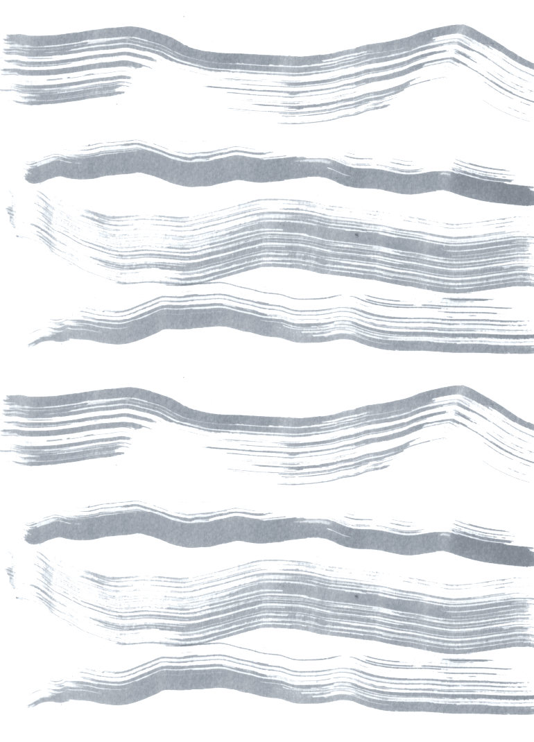
Hand-made treasures, call for hand-made elements. We played with loosely painted ink strips to suggest water and island scapes and created a simple fern leaf motif to anchor the entire brand identity. The font needed to be clean and timeless — Tall Grotesk San Serif was the perfect pairing, bringing boldness to the brand’s softer side. The contrast of strength and softness work beautifully together.

APPLICATION
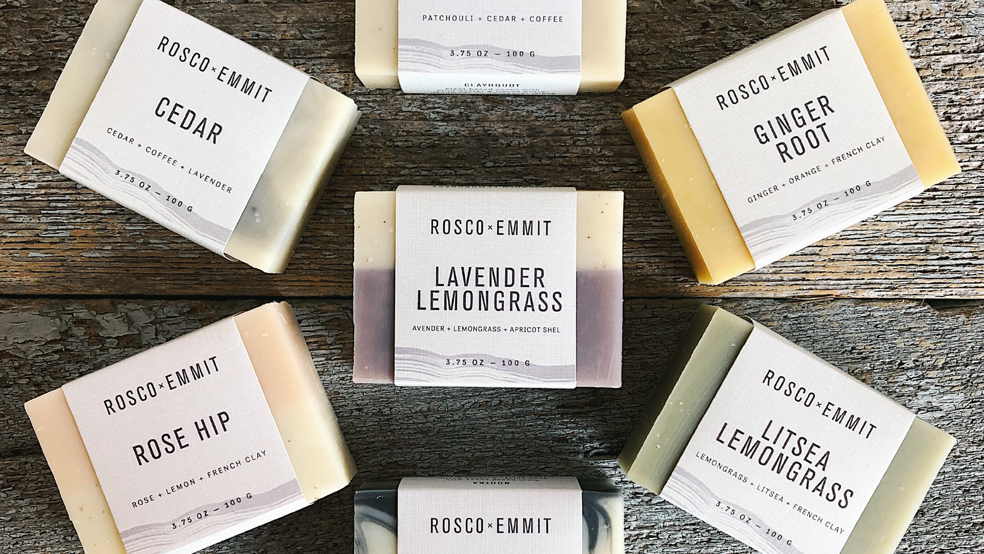
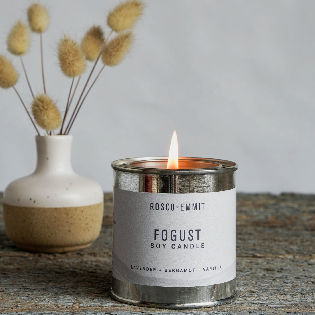
Packaging plays a crucial, tactile role in the Rosco Emmit brand story. It needed to mirror the softness of the visual elements, while highlighting the name and details of each product with clarity. We designed a simple word-mark and series of stamps that can be used in all of their packaging, one that works in harmony with their online identity and elevates the entire experience for the customer.


TESTIMONIAL
“Clever Jane’s creative process was intuitive and inspirational. They honed in on what matters most to me and my clients. My new cohesive brand identity has resulted in a significant increase in sales and customer inquiries. I can’t recommend Clever Jane highly enough. Not only were they smart, creative and professional, they were so much fun to work with! I love my new branding. Clever Jane drew me out of my monochromatic comfort zone and into a beautiful, colourful new era.”
~ Kerry Owens – Rosco Emmit ~

a clever jane and majorette collaboration
A SPECIAL THANKS TO
KERRY — @rosco_emmit
PHOTOGRAPHY — @rosco_emmit
CLEVER JANE — art direction, strategy, identity design
Liz Parsons, Emily Kiana, Barry Begus
